llamalo
Chat interface for local Ollama llms, on Github

I built llamalo as a bridge between Ollama's powerful local model capabilities and a user-friendly conversational interface, giving users the ability to interact with locally-run models while maintaining complete data privacy.
I architected the React application using Vite for rapid development, leveraging modern tooling to deliver a responsive, performant chat interface. I focused on creating an intuitive conversation flow that feels natural—mirroring the simplicity of a terminal but with visual clarity. I optimized the runtime performance to ensure smooth interactions even with larger models.

User Experience Strategies
Conversational Flow Design
before
Raw terminal output with markdown formatting
after
Organized chat interface with clear message boundaries, conversation history navigation, and responsive layout using flexbox
impact
Reduced cognitive load for users navigating multiple conversations
Model Selection
before
Complex and manual configuration of models and parameters
after
Context-aware model selection—users can choose models per conversation or per individual prompt
impact
Lowered friction for users experimenting with different models and settings
State Management Decisions
- LocalStorage: Persistent conversation storage with browser-native API.
- React Hooks: Utilized
useState for UI state, useEffect for API interactions, and useRef for DOM references.
- Modular State: Separated conversation list state from message rendering state.
Key Technical Decisions
- Ollama API Integration: Direct API consumption via fetch for minimal dependencies and type-safe calls.
- LocalStorage Architecture: Browser-native storage for conversations to ensure zero server requirements and complete privacy.
- TailwindCSS: Utility-first CSS with
@apply directives for readable organization and informed defaults.
- Accessibility-First Development: Ensured WCAG compliance using semantic HTML, ARIA labels, and keyboard navigation.
Lessons Learned
- Privacy as a Feature: Audience actively sought privacy-first solutions.
- Simplicity Wins: The minimal design philosophy aligned with user expectations for AI tools.
- State Management Matters: Proper hook usage enabled scalable conversation management.
- Tooling Accelerates: Vite + TailwindCSS enabled rapid prototyping and iteration.
TLDR
A privacy-focused AI chat interface that empowered users to experiment with local LLMs without compromising data security. The design philosophy is minimalist, user-centric, technically sound, and demonstrates how frontend engineering, UX design, and developer experience converge to create products that are both beautiful and functional. Privacy as a feature, simplicity wins, and tooling acceleration.
The Sensing Engine
Innovation project centralizing knowledge assets across a multi-industry consulting organization.
The consulting team required a unified system to aggregate market research, project documentation, industry trends, and team insights into a searchable, collaborative platform. With historical and current inputs available in a single search, the Sensing Engine is the first place to go for data on the next client project.
Together with a team of 5 developers and 1 designer, we built a multi-platform enterprise knowledge management system combining:
- Custom Salesforce Lightning applications
- React and Vue web applications
- Node.js microservices architecture
- Chrome extensions
- Quip live apps

The Sensing Engine features a custom Salesforce app that offers real-time feeds of document submissions, analytics, trending reports, and searchable content. It also includes Record Cards for detailed descriptions of supported content types.
React and Vue apps were also built to serve as interfaces within the consulting team's document directory, enabling efficient searches across various documents and external links. Across all interfaces in Salesforce, Quip, and otherwise, responsive design was across desktop and mobile devices, achieving 100% cross-browser compatibility. The project further expanded by creating spin-off applications, Insights and Signals, tailored to other teams' data requirements while maintaining a cohesive aggregation of sources.

Key Technical Decisions and Implementations
Salesforce as Source of Truth
what
Centralized all submission metadata in Salesforce
why
Enterprise system with authentication, permissions, and audit trails already in place
how
Custom Lightning applications using TypeScript for all custom components
Node.js Monorepo Architecture
what
Single repository managing multiple applications
why
Shared codebase, consistent development workflow, easier maintenance
how
Express-based API handling data via Salesforce Connect
effect
Optimized API search response times with indexing, materialized views, and connection pooling, reducing load times by 150-300ms.
Quip Live Apps
what
Embedded React applications within Quip documents
why
Users already had Quip installed; minimized friction for adoption
how
React + LESS for styling; replicated list and record views
Chrome Extensions
what
Browser-based content labeling tool
why
Users could capture relevant content from any web source
how
auto-collected and auto-labeled content pushed to system
Highlights
- Integrated Data: data sourced from several silos all indexed
- Single Search: high performance queries enabling seamless discovery
- User Engagement: consistent growth via marketing
- Spin-off Applications: multiple department-specific apps
This comprehensive system resulted in a 75% adoption rate among the team members, with significant growth attributed to user engagement and consistent marketing through all-team calls. The Sensing Engine also inspired several spinoff applications that catered to different departments' unique data needs while preserving a unified approach to information aggregation and analysis.
Lessons Learned
- Modular Design: The monorepo structure enabled successful spin-off applications for different departments.
- Platform Integration: Leveraging existing tools (Salesforce, Quip) reduced implementation complexity.
- User-Centric Search: Powerful search functionality was critical to adoption success.
- Cross-Platform Approach: Chrome extensions complemented web applications by addressing different user workflows.
TLDR
An enterprise integration project pre-RAG that organized disparate consulting data into a single source, accessible by a team of ~2k users.
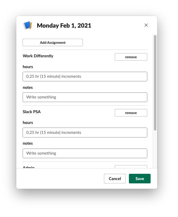
Enterprise Timesheets in Slack
Application embedded within Slack chat interface
When our company acquired Slack, internal teams were tasked with building within the new platform. Our team was asked to replace a cumbersome, error-prone Salesforce application with something intuitive and familiar. The challenge: build a seamless time tracking experience within Slack while integrating with existing Salesforce infrastructure.
I leveraged the Slack Design System to create an intuitive interface that users would naturally gravitate toward. I optimized the integration between Slack and Salesforce to minimize friction for both users and developers.
Key Technical Decisions
Slack Design System Integration
what
Leverage Slack's visual language
why
Users already knew the platform; familiarity drives adoption
how
Used Slack Design System components for consistency
Salesforce Integration via SOAP
what
Use SOAP API for timesheet data
why
Enterprise system with authentication and audit trails
how
Node.js middleware handling Salesforce Connect
Slack Modal Architecture
what
Built custom modals within Slack
why
Maximum context retention for users
how
Slack's block kit with custom HTML
User Experience Strategies
The application we replaced was a complex and slow-performing form in Salesforce with a steep learning curve. We pursued the Slack-native modal interface with familiar chat-based interactions to utilize existing user skills and comfort in the popular chat app. This choice reduced onboarding time to collecting time data and increased adoption among non-technical users unfamiliar with Salesforce.
The Slack Time Sheets application significantly improved time management within the team. Users reported a 20% increase in their overall productivity due to the app's streamlined workflow. The app minimized manual errors associated with traditional time tracking methods, leading to more accurate data collection.
Beyond our team, the design language we established inspired several other teams to strategize their own new applications on the new platform, demonstrating how thoughtful UX decisions and empowered teams can influence organizational technology adoption.
Lessons Learned
- Platform Familiarity Wins: Users prefer tools they already know, and Slack's design system was crucial.
- Design Language Matters: Our design choices inspired other teams to adopt Slack-native patterns.
- Integration Complexity: Balancing Slack and Salesforce APIs required intentional API design.
- Early Platform Limitations: We had to work around Slack's early development restrictions, pushing the tool to develop in new ways.
- Design as Leadership: Our design choices influenced organizational strategy for future Slack apps.
TLDR
Time Sheets is a Slack app for replacing a cumbersome application in Salesforce, adding a layer of usability and familiarity to an internal tool.
Survey Application for Quip Documents
Collaborative survey building and answering, embedded within documents

Our organization needed a way to gather qualitative data from hundreds of stakeholders within our existing Quip document ecosystem. Traditional tools like Google Forms limited collaboration to single-user submissions. Our team recognized that Quip's document-based structure could enable something more powerful: real-time, multi-user survey contributions embedded directly within business documents. The goal: create a collaborative survey system that could handle concurrent inputs from ~2,000 coworkers while maintaining the document's native design and functionality.
User Experience Improvements and Optimization Strategies
Collaborative Data Entry Flow
before
Single-user form submissions with limited context
after
Multi-user concurrent contributions within a single document
impact
Enabled real-time collaboration on qualitative data collection
Document-Integrated Survey Experience
before
External forms disconnected from business context
after
Surveys embedded directly in Quip documents, the doc ecosystem providing contextual relevance
impact
Users could reference document content while responding
Visual Hierarchy & Readability
before
Generic form layouts
after
Quip-native styling with clear response fields and submission states
impact
Improved usability and reduced cognitive load
State Management Architecture
before
Sequential form submissions
after
Real-time state synchronization across concurrent users
impact
Consistent data aggregation and immediate feedback
Key Technical Decisions
- Quip Live App Integration: Build on Quip's React library, embedding apps within documents and providing zero friction for users.
- Ruby on Rails Backend: Utilized the mature Rails framework with strong testing culture to build RESTful API with form validation.
- PostgreSQL Database: Structured storage, robust ACID compliance for survey data, and a normalized scheme for tracking and analysis of responses.
- Early Unit Testing: Extensive testing before deployment providing long-term reliability over rapid iteration.
Lessons Learned
- Platform Integration Wins: Quip's collaborative engine was essential for real-time contributions.
- Design Context Matters: Embedding surveys in documents preserved business context.
- Testing Enables Longevity: Early extensive testing ensured 2-year operational stability.
- Qualitative Data Value: Multiple users could provide richer, more nuanced responses.
- Documentation as Design: The app maintained document design integrity while adding functionality.
TLDR
I created a Survey Quip Live App that embeds surveys inside documents, allowing multiple users to concurrently contribute to and review structured, qualitative data. Building from a library of react components from Quip, this app enables real-time contributions and reviews from multiple users, fostering collaboration and data-driven decision-making. Extensive unit testing early in the development process resulted in a robust application capable of lasting for approximately two years beyond its initial release.
Sand Company
Glitches and looping digital abberations
Inspired by GIMP's image manipulation filters, I built sandco as a personal creative tool to automate the distortion of images and the animation of pixel displacement. I wanted to create a sophisticated pixel manipulation system that transforms static images into living, glitching digital art while maintaining control over the creative process.
I designed the pixel manipulation algorithms that generate unique glitch patterns. I built the automation processes that enable batch image processing and animation. I created the Python infrastructure that transforms simple pixel operations into complex, dance-like digital performances.
Key Technical Decisions
Pillow Library Integration
what
Use Pillow for pixel manipulation
why
Mature library, efficient image processing
how
Direct pixel access via PIL operations
Positional Relationship Algorithm
what
Analyze pixel positions relative to displacement map image
why
Creates organic, amazing distortions
how
Grid-based position analysis
Animation Frame Generation
what
Generate sequential frames from static distortion
why
From static glitch to animation, so cool!!
how
Frame-by-frame pixel displacement with easing
Lessons Learned
- Automation Amplifies Creativity: Tools that automate repetitive tasks free up creative energy.
- Pixel-Level Control: Understanding pixel relationships enables unique artistic effects.
- Animation as Process: Animation is a process, not just a frame sequence.
- Minimalism Works: Simple interface with powerful backend is more maintainable.
- Personal Projects Matter: Building for oneself can lead to unique technical solutions.
TLDR
sandco transformed how I approach digital art creation. The automated pixel manipulation system enabled me to produce glitch art at scale, creating animations that would have taken days of manual work in minutes. The repository showcases the complete system, serving as a portfolio piece that demonstrates technical proficiency in Python, creative problem-solving, and the ability to build tools that enhance human creativity. Creativity and technical execution are not mutually exclusive.